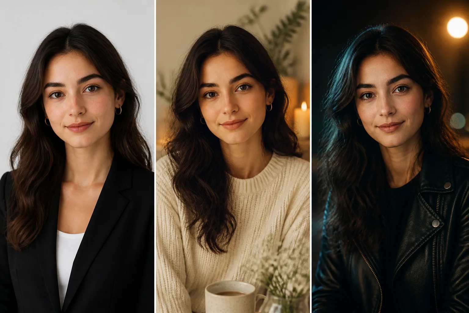
Your Ideal Selfie: How Backgrounds, Props, and Lighting Shape Better AI Portraits
A great AI portrait is never just about a face. The space around you, the objects you include, and the way the light falls all help define the story the image tells. In other words, context matters as much as your features. A clean background can make you look more polished and professional, while a busy scene can make even a strong portrait feel cluttered and hard to read. Research on portrait composition shows that simple, non-distracting backgrounds let the face dominate the visual hierarchy, while cluttered or contrasting environments can pull attention away from the subject and reduce impact. DailyPhotoTips notes this effect clearly in its discussion of portrait backgrounds: https://dailyphototips.com/portraits/portrait-backgrounds/
That same principle applies to AI-generated selfies, except you have even more control. You can choose a studio look for a LinkedIn profile, a lifestyle setting for social content, a cinematic scene for creative work, or a softer, more intimate atmosphere for a dating profile. The best portraits are not random combinations of face, props, and scenery. They are intentionally aligned visuals where each element supports the same message. When that happens, the result feels credible, polished, and emotionally clear.
Why Context Matters as Much as Your Face in AI Portraits
People do not read portraits in isolation. They infer mood, status, identity, and intent from everything surrounding the face. A person framed in a neat studio setup feels different from the same person placed in a messy room or dramatic outdoor scene. That is because the brain uses environmental cues to fill in the story. A portrait is not only a likeness, it is a signal.
This is why some AI portraits feel surprisingly authentic while others feel off, even when the face itself looks convincing. If the background, clothing, and lighting communicate different messages, the image becomes confusing. A formal blazer in a neon party scene, for example, may look stylish in theory, but if the lighting is soft and the pose is serious, the picture can feel like it belongs to three different concepts at once. Context is the glue that makes the image believable.
Start With the Goal: Branding, Dating, Creative, or Casual
Before choosing a background or prompt, decide what the portrait is supposed to do. The best AI selfie for a professional profile is not the same as the best image for a dating app or a creative portfolio. Each goal has its own visual language.
For branding and professional use, you usually want clarity, trust, and competence. That means a clean background, controlled lighting, and wardrobe details that suggest confidence without distraction. For dating profiles, the sweet spot is often warmth and approachability. The image should feel natural, friendly, and real, not overproduced. For creative work, you can lean into atmosphere, bold colors, dramatic shadows, or conceptual settings. For casual social content, the look can be more relaxed and personality-driven, as long as it still feels intentional.
A useful question is: what should someone think in the first two seconds? If the answer is professional, playful, artistic, or approachable, then every visual choice should reinforce that impression. If the answer is not clear, the portrait will probably feel diluted.
Choosing the Right Background: Studio, Lifestyle, Dreamscape, or Mood Scene
Backgrounds do more than fill empty space. They shape mood, create depth, and steer attention. According to DailyPhotoTips, simple backgrounds make portraits feel more polished and help the face remain the center of attention, while distracting backgrounds compete with the subject. That is especially important in AI portraits, where overly detailed scenes can easily overpower the face.
A studio background is the safest choice when you want professionalism and versatility. Neutral grays, soft gradients, plain white, or subtly textured backdrops work well for resumes, LinkedIn, and business websites. They suggest control and seriousness without stealing focus. If you want a modern editorial feel, a simple backdrop with slight shadowing can add depth without becoming busy.
Lifestyle backgrounds work well when you want the portrait to imply a real-world identity. A desk, bookshelf, kitchen, café, or creative workspace can signal profession or routine. Environmental portraits rely on this effect, where the setting helps tell the subject’s story. DailyPhotoTips gives the classic example of a chef in a kitchen or a musician with instruments, showing how the environment becomes part of who the subject appears to be.
Dreamscape backgrounds are more expressive. These might include a tropical shoreline, a city at dusk, a foggy mountain ridge, or a surreal digital scene. These work best for artistic branding, album artwork, campaign visuals, or stylized social posts. The risk here is overdoing it. If the background is too visually dominant, the face can lose importance and the portrait begins to look like a poster rather than a self-portrait.
Mood scenes sit between realism and fantasy. Think rain-streaked windows, softly lit interiors, moody alleyways, golden fields, or a warm evening balcony. These scenes add emotional tone without needing to be wildly imaginative. They are especially effective when you want a portrait that feels cinematic, reflective, or intimate.
Renso Art also points out that texture, gradients, and stylized backgrounds can deepen emotional tone. Smooth surfaces often project calmness, while textured ones add richness and drama. That means a flat backdrop is not always boring. Sometimes flatness is exactly what makes a portrait feel calm, clean, and premium. https://www.rensoart.com/how-backgrounds-shape-a-portrait/
How Props and Clothing Details Signal Personality and Intent
Props and clothing are quiet storytellers. They do not need to shout to change perception. A blazer, camera, book, guitar, notebook, coffee cup, or sports jacket can instantly shift the viewer’s interpretation of who you are and what you value. In visual culture, these items function as non-verbal cues of profession, hobbies, status, and identity.
A study on Latina influencers in media shows how creators use props, clothing, and décor to communicate identity and authenticity, while also avoiding the feeling of being staged. That point matters a lot for AI portraits. Even when an image is generated, the props should feel like they belong to the subject’s world instead of being random accessories. https://www.mdpi.com/2673-5172/3/3/29
Wardrobe should match the story. A fitted black turtleneck can suggest design, tech, or artistic seriousness. A soft sweater may feel warm and approachable. A crisp shirt or blazer leans professional. Athletic clothing can imply vitality, routine, and discipline. Small details matter too, such as jewelry, glasses, a watch, or even how formal the neckline feels. These details can either support the intended message or create friction if they seem out of place.
The key is consistency. If the portrait is meant to suggest a startup founder, a hoodie may work if the setting is modern and the pose is confident. But if the scene is a classic corporate office, the same hoodie might weaken credibility. If you want a creative identity, a more expressive outfit may help. If you want trust, simplicity usually wins.
Lighting Basics: Soft vs Hard Light, Warm vs Cool Tones, High vs Low Contrast
Lighting is one of the biggest reasons AI portraits succeed or fail. It changes shape, tone, realism, and emotional impact. Brightness matters, but so does the character of the light. Scientific research published in Scientific Reports found that people reported more positive mood under bright light compared with dim light after 30 to 50 minutes, which helps explain why well-lit portraits often feel more open and energizing. https://www.nature.com/articles/s41598-021-93523-y
Soft light spreads gently across the face, reducing harsh shadows and smoothing transitions. It is flattering, approachable, and often ideal for dating profiles, personal branding, and portraits meant to feel warm or inviting. Hard light creates sharper shadow lines and stronger dimension. It can look dramatic, editorial, intense, or fashion-forward. Neither is better in general. The right choice depends on the message.
Warm and cool color temperatures also change perception. Research on white light shows that warm light around 2700 to 3000 K tends to feel cozy, serene, and stable, while higher color temperatures around 6000 K can feel cooler, more alert, and more arousing. That makes warm light a strong choice for friendly, human, relatable portraits, while cool light is often better when you want a crisp, modern, or serious look. https://pmc.ncbi.nlm.nih.gov/articles/PMC8481791/
High contrast lighting creates a bolder mood. It is common in fashion, noir-inspired images, and dramatic character portraits. Low contrast lighting feels gentler and more accessible. Flat lighting is not always bad, especially for clean profile photos, but too little separation between light and shadow can make a face look less dimensional. DailyPhotoTips also notes that lighting direction and subject-background separation influence depth, with stronger separation emphasizing the subject while flat lighting can make the background more distracting. https://dailyphototips.com/portraits/portrait-backgrounds/
How Color Mood Changes Perception and Emotional Impact
Color is emotional shorthand. A warm palette with amber, gold, beige, or soft red tones can feel inviting and intimate. A cool palette with blue, gray, silver, or teal can feel clean, distant, polished, or intellectual. When the background color and lighting color work together, the portrait becomes more coherent and easier to interpret.
Renso Art notes that strong warm-versus-cool contrast helps subjects pop, such as warm skin against a cool blue or gray background, or the reverse. That contrast can be extremely effective in AI portraits because it creates separation and visual clarity. https://www.rensoart.com/how-backgrounds-shape-a-portrait/
The emotional effect depends on alignment. Warm light feels especially comfortable when paired with warm-colored surfaces or walls. Cool light works better in cool-toned environments. A mismatch is not always wrong, but it can feel less natural. If your portrait has a warm golden-hour look, a sandy or sunset-toned background usually supports that mood better than a sterile blue room. If the image is meant to feel sleek and futuristic, cool tones and sharper edges may be the better match.
Color also affects credibility. For many personal branding or dating images, a portrait that feels too intense or overly stylized can reduce approachability. Softer color choices, lower saturation, and cleaner backgrounds often increase trust because they feel less performative. That does not mean boring. It means visually clear and emotionally legible.
Scene-Tool Matching: Keeping Background, Props, and Face Style Consistent
The most believable AI portraits happen when every element belongs to the same universe. If the face is styled as polished and natural, the background should not look like a sci-fi movie set unless that contrast is intentional. If the props suggest a writer, artist, or athlete, the clothing and lighting should reinforce that identity. This is what scene-tool matching is about: making the pieces agree.
Think of it as visual logic. A corporate portrait usually pairs well with a neutral background, structured clothing, and controlled lighting. A creative portrait can handle more texture, expressive poses, and stylized color. A beach scene makes more sense with relaxed clothing and softer light than with a severe black blazer and hard flash. When the face style, environment, and accessories all tell the same story, the portrait feels much more realistic.
This is also where AI prompt quality really matters. If you ask for a “professional portrait” but add a neon club background, tropical props, and cinematic fog, the model may produce something interesting but not necessarily coherent. Better results come from choosing one dominant mood and letting the rest support it.
Common Mistakes That Make AI Portraits Feel Busy or Unnatural
The biggest mistake is overloading the frame. Too many props, too much texture, too many colors, or a background with competing points of interest can make the image feel chaotic. In portrait composition, clutter steals attention from the face, which is usually the one thing you want viewers to notice first.
Another common problem is concept mismatch. A serene face with aggressive lighting, or a formal outfit in an obviously playful setting, can create tension that feels accidental rather than artistic. In AI images, the gap between intention and execution is often what makes the result uncanny. The more clearly the scene supports the subject, the more natural the portrait feels.
A third mistake is poor depth control. If the background is too close in tone to the subject, or if the lighting does not separate the subject from the scene, the portrait can appear flat. Similarly, if the subject and background are both highly detailed, the eye has nowhere to rest. Simpler is often stronger, especially for profile pictures and professional use.
Finally, avoid props that are too generic or too random. A laptop in a workspace is useful. A pile of unrelated items is not. A guitar in the hands of a musician makes sense. A guitar in a law-firm portrait does not, unless the point is personality contrast and even then it needs care.
Before-and-After Prompt Swaps: Small Changes, Big Vibe Shifts
One of the easiest ways to understand portrait context is to compare tiny prompt changes. The face can stay the same while the emotional result changes dramatically.
Example 1: professional branding. A prompt like “clean studio portrait, soft gray background, natural skin tones, subtle side light, confident expression” will create a more polished business image than “same face, neon office, dramatic shadows, glossy reflections, high contrast.” The first feels dependable. The second feels bold and editorial.
Example 2: dating profile. “Warm window light, relaxed sweater, blurred café background, gentle smile” signals approachability. Change only the lighting to “cool overhead light, hard shadows, dark background,” and the portrait becomes less welcoming, even if the face and pose are unchanged.
Example 3: creative portrait. “Rainy city street at dusk, reflective pavement, moody blue tones, cinematic depth” gives a narrative quality that a plain wall cannot. But if the same prompt adds too many props, too many colors, and a busy storefront behind the subject, the image may lose focus. The shift from elegant to cluttered can happen with just one or two extra details.
These small swaps are powerful because portraits are built on perception. A viewer reads the scene in milliseconds. Tiny changes in color, contrast, or surrounding objects can completely alter the vibe.
Prompt Templates for Professional Profiles, Social Posts, and Personal Branding
If you want more consistent results, build prompts around purpose instead of decoration. Start with the role, then add the visual cues that support it.
For a professional profile: “Realistic head-and-shoulders portrait, clean neutral studio background, soft diffused light, natural skin texture, subtle shadow separation, professional attire, confident expression.”
For social media: “Natural portrait in a bright lifestyle setting, relaxed clothing, warm daylight, soft background blur, friendly expression, candid but polished feel.”
For personal branding: “Editorial portrait with controlled contrast, modern textured backdrop, carefully styled wardrobe, strong but approachable expression, refined color palette, realistic depth.”
For a more custom creative scene, tools like Selfie AI: AI Photo Generator can be useful because they let you explore many different categories and even build fully custom scenarios with your own likeness. If you want to test how a background or wardrobe swap changes your look, you can try it here: https://findthe.app/selfie-ai-0xi7wd
Final Checklist for More Intentional, Polished AI Selfies
Before you generate your final image, check whether the scene supports the purpose. Ask yourself whether the background is clean enough for the subject to stand out. Ask whether the props communicate identity rather than clutter. Ask whether the lighting matches the intended emotion, whether warm, cool, soft, hard, bright, or contrast-heavy. And ask whether the color palette feels consistent from face to background to clothing.
A strong AI portrait should feel readable at a glance. It should not make people work to understand it. If you want trust, keep the background simple and the lighting clean. If you want warmth, lean toward softer light and welcoming colors. If you want drama, increase contrast and choose a scene with depth. If you want authenticity, make sure every prop and wardrobe choice feels like part of the same story.
The best selfies are not just flattering. They are intentional. Once you start thinking like a director instead of just a subject, your AI portraits become much more useful for social media, personal branding, portfolios, and dating profiles alike.