Why Your AI Selfie Style Needs an Accessibility Audit: Making Portraits Inclusive for All
AI-generated selfies are no longer just playful experiments. They are profile images, campaign visuals, social posts, portfolio assets, and sometimes the first impression someone gets of a person or brand. That is exactly why an accessibility audit matters. If your AI selfie style looks polished but is difficult to read, you may be excluding a large part of your audience without realizing it. The CDC estimates that about 7 million people in the U.S. have vision loss and about 1.1 million are blind, which means accessibility is not a niche concern. It is part of making portraits usable, understandable, and welcoming for real people. Source: https://www.cdc.gov/vision-health-data/prevalence-estimates/vision-loss-prevalence.html
An accessibility audit for AI selfies is not about making your images bland or overly rigid. It is about checking whether the portrait can still communicate clearly when someone has low vision, color-vision differences, a small screen, poor lighting, or limited attention. The best AI portrait styles do more than look fashionable. They make the face easy to recognize, the message easy to understand, and the visual hierarchy easy to scan.
What an Accessibility Audit for AI Selfies Actually Means
An accessibility audit for an AI selfie style is a practical review of how readable and interpretable the portrait is before you publish it. You are checking contrast, lighting, facial visibility, composition, text overlays, and whether the image still works when viewed quickly or under less-than-ideal conditions. In other words, you are asking a simple question: if someone cannot rely on perfect vision or perfect screen conditions, does this image still make sense?
That question matters because AI portraits often push style first and clarity second. Dramatic shadows, bright bloom, highly stylized filters, busy backgrounds, and text placed directly on top of the face can all make a portrait harder to process. An audit helps you catch those issues early, before they become a barrier to understanding.
A useful way to think about it is the same way designers think about any visual communication. If the face is the subject, it should remain readable. If text is present, it should meet contrast expectations. If the background is decorative, it should not compete with the main subject. And if the image includes identity cues, they should remain visible rather than being lost in effects.
Why Inclusive Portrait Design Boosts Reach and Engagement
Accessible design is not only ethical, it is effective. When an AI selfie is easier to read, it becomes easier to engage with. Viewers are less likely to scroll past a portrait they can immediately understand, and more likely to trust a visual that feels intentional instead of chaotic. That can translate into stronger performance across social platforms, brand pages, and portfolio sites.
There is also a practical engagement angle. Research on photo filtering found that in a dataset of 7.6 million Flickr images, filtered photos were about 21% more likely to be viewed and 45% more likely to be commented on. Source: https://ojs.aaai.org/index.php/ICWSM/article/view/14622 The takeaway is not that every filter is good, but that visual treatment changes how people respond. When you use AI styling deliberately, with accessibility in mind, you can preserve that engagement boost while reducing the risk of excluding viewers.
Accessible portraits also strengthen brand trust. People tend to notice when a visual feels difficult to decode, even if they cannot explain why. Clear lighting, balanced color, and legible text create a more professional impression. That professionalism matters whether the portrait is for a creator profile, a business headshot, or a promotional graphic.
Common Accessibility Problems in AI-Generated Portraits
Some of the most common issues in AI-generated portraits are subtle, but they add up quickly. The face may be partially hidden by hair, shadows, motion blur, overlays, or extreme angles. The background may be visually loud. The skin tones may be shifted so far by the style that the subject looks flat or unnatural. Text may sit on a complex area of the image and become nearly impossible to read.
Another frequent problem is overprocessing. AI models often produce striking results by exaggerating contrast, glow, and saturation, but those same choices can reduce clarity. A portrait can look dramatic at first glance and still fail an accessibility check because key facial features disappear into shadow or highlights blow out the cheek, eyes, or mouth.
There is a big difference between artistic stylization and visual obstruction. Inclusive portrait design keeps the expressive qualities of the image while preserving enough structure for the viewer to understand the subject immediately.
How Lighting and Glare Affect Facial Readability
Lighting is one of the most important parts of portrait accessibility. If the face is underlit, overexposed, or split into harsh light and shadow, many viewers will struggle to read expression and identity. That is a problem for everyone, but especially for people with low vision or anyone viewing on a small display.
The ICAO Portrait Quality technical report recommends uniform illumination without shadows or reflections on the face, visible gradations of skin texture, accurate reproduction of skin tones, and strong contrast between face, hair, and background. Source: https://www.icao.int/sites/default/files/TRIP/Publications/TR-Portrait-Quality-v1.0.pdf Even though it was written for portrait quality standards, the guidance is very useful for AI selfies too. If the face is the focal point, the light should support recognition rather than distort it.
Glare is another common issue. Shiny highlights on the forehead, nose, glasses, or cheeks can mask detail and make the image harder to read. If your AI portrait style tends to generate glossy skin or intense reflections, try softening the light, lowering specular highlights, or choosing a more diffuse scene. The goal is not to erase texture, but to avoid lighting that competes with facial features.
A simple rule of thumb is this: if the eyes, mouth, and overall face shape remain clear at a glance, the lighting is usually helping. If the subject looks carved out of shadow or washed out by brightness, accessibility is probably suffering.
Using Color Contrast to Make Portraits Easier to Interpret
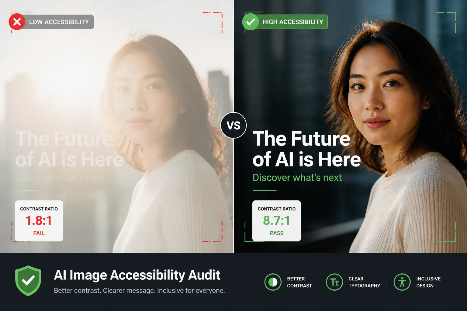
Color contrast is essential when a portrait includes text, buttons, labels, or any kind of message layered on top of the image. WCAG 2.1 AA requires a contrast ratio of at least 4.5:1 for normal text and 3:1 for large text, and those rules also apply to images of text. Source: https://www.w3.org/WAI/WCAG21/Understanding/contrast-minimum.html?pt=BureoF4GVB MDN’s accessibility guidance says the same principle should guide your color choices. Source: https://developer.mozilla.org/en-US/docs/Web/Accessibility/Guides/Understanding_WCAG/Perceivable/Color_contrast
If you want enhanced readability, WCAG AAA raises the target to 7:1 for normal text and 4.5:1 for large text. That is a strong benchmark for text overlays on AI portraits, especially when the image has a busy background or a dramatic palette. The more stylized the portrait, the more deliberate your contrast planning needs to be.
This is not a minor concern. In a static CSS analysis of 240 homepages among the Common Crawl top 500 domains, 40.9% of foreground and background color pairings failed to meet the minimum 4.5:1 contrast ratio for normal text. Source: https://arxiv.org/abs/2602.24067 If contrast is already a common failure on websites, it is easy to see how AI portraits with embedded text can go wrong too.
For portrait styles, the easiest fix is often to simplify the color relationship between subject and background. If the background is dark, keep text light and separate from the face. If the background is bright, use darker text and avoid placing it over skin tones or highly textured areas. If the palette is saturated, consider reserving one neutral zone for text so the message can breathe.
Composition Choices That Improve Clarity and Inclusion
Composition can either support accessibility or quietly undermine it. Framing the face too tightly can cut off important cues such as hair shape, expression context, or assistive details like glasses and earrings. Framing too loosely can make the subject feel small and force the viewer to hunt for the face in a busy scene. The sweet spot is usually a composition that centers the face, leaves enough breathing room, and keeps the main subject visually dominant.
A clean background often helps, but clean does not have to mean empty. It simply means the background should not fight the subject. If the portrait style uses a beach, city, studio, or fantasy environment, the environment should support the person rather than overpower them. This is especially important for viewers who rely on strong visual hierarchy to process an image quickly.
Expression clarity also matters. If the AI style turns the mouth, eyes, or jawline into abstract shapes, viewers lose an important part of the communication. A clear expression does not have to be literal or boring. It just needs enough definition that the emotional tone of the portrait remains obvious.
Inclusive composition is also about representation. AI styles should not make only certain faces look flattering or readable. A well-designed portrait style should work across skin tones, face shapes, hair textures, and accessory choices without forcing everyone into the same visual template.
Making Text Overlays and Captions Readable
If your AI selfie includes text, the text becomes part of the accessibility audit whether you intended it or not. Captions, names, taglines, and promotional copy should be easy to read without zooming in. That means choosing font sizes that are large enough, avoiding decorative typefaces that blur at small sizes, and keeping the text away from the most complex parts of the image.
A strong text overlay usually has three qualities: good contrast, enough spacing, and a background that does not compete with the letters. When those three things are missing, even a beautiful portrait can become hard to understand. Text should never be an afterthought pasted over a face, hand, or bright highlight.
Also remember that accessibility does not stop at the visible text. If the image is posted online, use alt text for all non-text elements, including images and logos. The CBM Digital Accessibility Toolkit advises including alt text for all non-text elements and notes that decorative images may have empty alt text. It also recommends avoiding openings like “image of” or “picture of.” Source: https://www.cbm.org/digital-accessibility-toolkit That guidance helps your portrait reach users who rely on screen readers.
When the image contains text that is essential to understanding the message, make sure the same information appears in the surrounding post copy or page text as well. That way, the meaning is not trapped inside the image.
Practical Fixes for More Accessible AI Portraits
The good news is that most accessibility issues in AI portraits can be improved with a few simple adjustments. Start with light. Choose softer, more even illumination and reduce harsh shadow edges. Then review the palette and make sure the face does not blend into the background. After that, check the crop and ask whether the subject’s expression remains visible without effort.
If your current style uses heavy filters, try dialing them back slightly. Filters can still add energy and personality, but the goal should be clarity first and flair second. You can often preserve the style by reducing glare, lowering saturation just enough to prevent visual noise, or keeping the most intense effects away from the face.
For text-heavy portraits, create a dedicated area for the copy, ideally away from the eyes and mouth. Use a solid or semi-opaque panel if needed. And when the image will be shared widely, test it at mobile size. A portrait that looks fine on a desktop monitor can fail completely on a phone.
A good accessibility habit is to ask a quick checklist after each generation: Can I identify the face instantly? Can I see the expression clearly? Does the text meet contrast needs? Does the background help or hinder comprehension? If any answer is no, regenerate or adjust.
Tools and Checklists to Audit Your Selfie Style
You do not need a complicated process to make accessibility part of your portrait workflow. A simple checklist can catch most issues. Review the image in grayscale to see whether contrast still holds. View it at thumbnail size to test recognizability. Check text overlays for readability against the background. Confirm that the face is not swallowed by shadow or glare. Then verify that your alt text is accurate and concise.
Tools can help too. PicFlow AI’s accessibility checker lets creators pre-analyze images for text visibility, color-blindness previews, and draft alt text before publishing. Source: https://picflowai.pro/accessibility-checker That kind of preflight check is useful because it moves accessibility earlier in the process, where fixes are easier and cheaper.
If you work with a team, consider adding one more layer: ask someone else to review the portrait without context. If they can understand the subject, mood, and message quickly, the image is probably doing its job. If they have to guess, the visual needs refinement.
Inclusive vs. Exclusionary Portrait Examples
An inclusive AI portrait might use soft side lighting, a plain but attractive background, a visible face, and a short caption placed in a high-contrast area. The expression is clear, the subject is centered, and the overall image feels polished without becoming difficult to decode. Someone with low vision, a color-vision difference, or a small screen can still understand what is happening.
An exclusionary portrait often looks more dramatic at first glance. It may use deep shadows across the eyes, glowing highlights on the skin, a busy background, and text placed directly over the forehead or jawline. On a large monitor, it may feel cinematic. On a mobile screen, it becomes a puzzle. That is the difference accessibility audits are designed to catch.
Another example is overstylized symmetry. AI portraits sometimes smooth away enough texture and shape that all faces begin to look similar. That might create a neat visual pattern, but it can also flatten identity and reduce recognition. Inclusive styles preserve the distinctiveness of the person while keeping the image readable.
How to Build Accessibility Into Your Creative Workflow
The easiest way to make accessibility real is to treat it like a normal part of creation, not a final cleanup task. Start with accessible prompts that prioritize clear lighting, readable expression, and simple backgrounds. Then review each result using the same checklist. Over time, you will learn which settings produce attractive images without sacrificing clarity.
This also applies when you use advanced creative tools. For example, if you are building custom AI portraits with Selfie AI: AI Photo Generator, you can treat accessibility as part of the style selection process instead of an afterthought. That means choosing portrait categories, custom prompts, and lighting directions that preserve readability while still giving you a distinctive look. Product link: https://findthe.app/selfie-ai-0xi7wd
It helps to keep a small style library of approved choices. Save examples of portraits that pass your accessibility check and note what makes them work. Over time, that library becomes your shortcut to more consistent, inclusive output.
Final Checklist Before You Publish an AI Selfie
Before you publish, run one last review. Is the face clearly visible? Is the expression easy to read? Does the lighting avoid harsh glare and deep shadows? Is the background supporting the subject instead of competing with it? If there is text, does it meet contrast needs and stay away from busy areas? Does the image still work at small size?
Then check the non-visual parts. Is the alt text accurate? Does the post copy carry any essential meaning that appears inside the image? Is the portrait consistent with your brand, your message, and the audience you want to include? If the answer is yes across the board, you are ready to publish.
Accessibility is not the opposite of style. In AI portraits, it is what makes style usable, memorable, and trustworthy. The more intentionally you audit your selfie style, the more likely your portraits will connect with a wider audience and leave a stronger impression.